It's time to redesign my personal website.
Why?
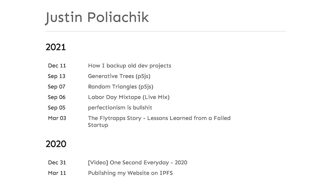
It's boring!
I'm much more creative and visual than the current site reflects. It also doesn't support anything other than basic markdown posts.
I'd like to spice it up with some generative art, a friendlier bio, and a place for long-form content like projects and case studies.
But Why Now?
- I'm inspired by seeing other personal sites, and in this new remote-first world I want to be open and inviting for others to connect with.
- I want to flex my design muscles a bit. This is a good exercise to solve problems for myself, learn Figma, and post about my process.
- Expand my opportunities - I want to stand out as both an engineer and designer.
The Design
Addressing the Problems:
Make it less boring
- Fix 'boringness' at its core with content, not pure "visual flair". Introduce more varieties of content - blog posts, projects, artwork, all with a personal touch.
Reflect my personality
- Add a good profile pic, a fun blurb, and some splashes of color.
- Important to keep things fluid and not too rigid.
- Needs to feel friendly and approachable - make people want to reach out and connect! Do this by being transparent and fun.
Support multiple media types
- Support posts with text, images, videos, code snippets, and custom widgets (eg p5js).
- I also need it to be incredibly easy to write and edit posts - this is paramount. Remove all hurdles to quickly adding content. Make simple posts easy, and make complex posts possible.
- Some content (blog posts) will be strictly dated and posted chronologically. Other content (long-running projects) won't. Have a place for both.
Inspiration
These are some of the personal websites I love, and drew inspiration from:
- Matt Lim - mattlim.me - great 'projects' section. clean, simple layout with sprinkles of personal touch.
- Cole Townsend - twnsnd.co - love the personal and authentic vibe. love the simple header.
- Paige Bailey - dynamicwebpaige.github.io/info - amazing guiding principles.
- Aileen Shin - aileen.co - beautiful project images.
Iterations
v0: starting point
Basically copied Matt Lim's header and projects section, with an added "Recent Posts" section. Using generative art header with 'regenerate' button
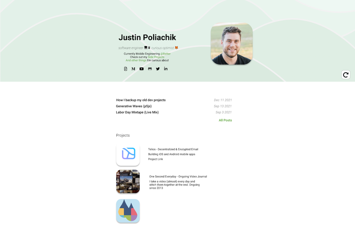
v1: clean the header
I wanted a more minimalist header like Cole's. Tried out an 'intro' phrase within the generative art component.
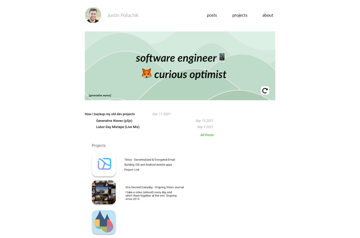
v2: refining
Wasn't a fan of text within generative art - very busy and text could be hard to read based on dynamic background content. Tried out a split section for intro phrase and recent posts. Refined projects component. Made header sticky at the top.
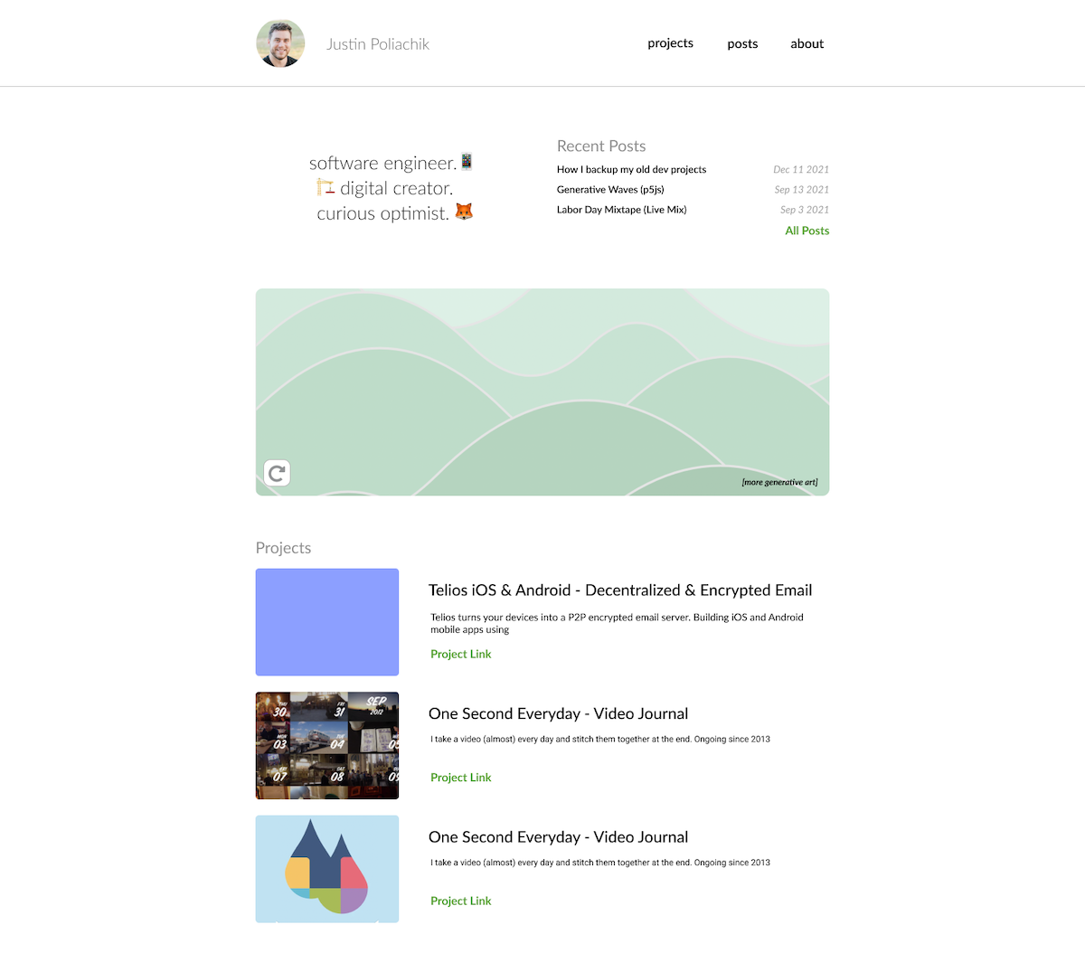
v3: getting closer
Needed a focal point on page load. Tried that out here with a heavy intro, and tested out other section layouts.
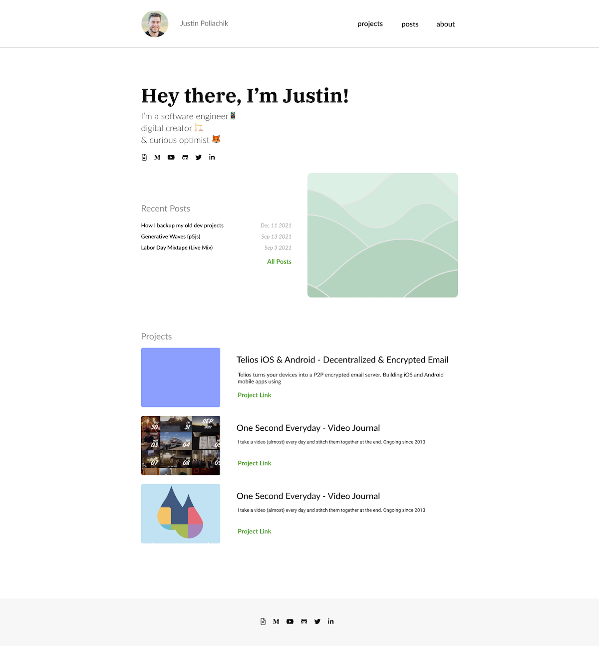
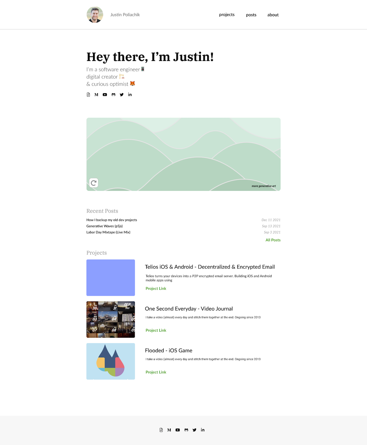
v4: final!
I wanted full-width generative art for balance, and also didn't want to squeeze the recent posts. Went full-width to make everything responsive without big layout changes. Happy to proceed with this!
Next Steps
I'm happy with the design and ready to build!
This was a fun project to force myself to slow down and go through the design process. I enjoyed flexing my design muscles a bit and getting more comfortable with Figma - it was my first project using it.