In late-2020 through mid-2021 I worked with my friend Justin Wolz (JW) to develop a two-sided marketplace Mobile App and Platform for personal training sessions. I joined as the technical Co-Founder at LifterRun as we set off on our side hustle to distrupt the fitness industry.
This is an overview of the product design and development work I did en route to a Minimally Viable Product.
The Problem
If you wanted to book a workout with a personal trainer within the day, could you?
It's surprisingly difficult to find a personal trainer outside of a big-box gym, and if you do it always requires a costly long-term commitment. This was a problem JW was experiencing first-hand in NYC. Why was it so difficult to book this incredibly common service?
And for personal trainers, it's also incredibly difficult to book clients. Most resort to working for gyms that may take 70% of the cut, or finding other side work. Why was it so difficult to find clients to fill the existing supply of trainers?
Both sides of the market were ripe for disruption. A solution which allowed trainers to list open availability hours for anyone to book seemed like a grand opportunity. It would fill inefficiencies on both sides of the market and make it easier for anyone to get training on-demand without a crazy commitment of time or money.
The Existing Market
Existing personal training solutions mainly fell into three broad categories
Gyms
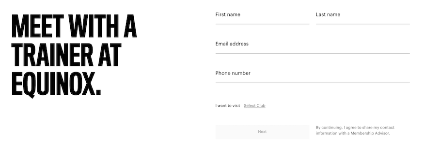
Big box gyms own the predominant market share for in-person personal training services. But they are the king of long term commitments and subscription lock-in. You'll need an existing gym membership first, then personal training services are add-ons. Good luck learning details, browsing trainers, or booking any of this online though. You'll need to enter their walled garden and speak to a sales rep first:
Professional Service Search Tools
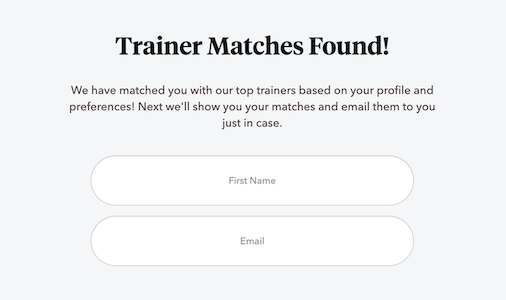
These tools allow personal trainers to post a profile online for a fee, and serve as a search directory for users to find trainers. Some are generic to all types of services (Thumbtack, Bark, Upwork) and some are specific to personal Training (FYT).
The experience is similar for all - a questionnaire and signup is required prior to seeing results (feels weirdly safeguarded). And the results vary widely in quality, requiring lots of effort on the user's behalf to sort through the data. Most trainers seem to require purchasing "packages" of multiple sessions, or some form of longer-term commitment, presumably to make the overhead of onboarding a new client "worth it".
Virtual Services
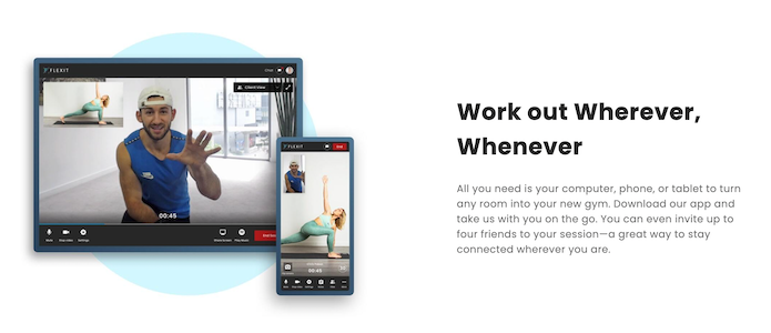
While Peleton and Apple Fitness+ are heavyweights in the fitness market, their scale only allows for broadcast virtual classes. For those interested in tailored 1:1 training, services to workout at home and pair with a coach are offered through FlexIt, Kickoff, and others. These offer a good experience and are cost effective, but don't provide the hands-on support some may need in a personal trainer. With LifterRun, we were betting that virtual training ultimately wouldn't replace the market for in-person training services. But for users looking to quickly book an on-demand workout, we would still need to compete with these virtual services in ease-of-use.
We believed there was a large gap in the market: on-demand in-person training which is incredibly easy to search and book. Nothing in the market filled that role.
Proposed Solution
We set out to solve problems on both sides of the market. For trainers, we wanted to offer a great opportunity to fill their schedule with clients and take home more money than they could otherwise. For users, we wanted a way to book a workout session on-demand with a great trainer specialized to fit their needs, without the hassle of a long-term commitment.
We aimed to build a two-sided marketplace (like AirBnB or Uber) to match trainers with users, in the form of a Mobile App.
The initial questions:
Location:
- Q: Where would workouts occur? Gyms aren't an option - they wouldn't allow an outside training service to use their space without a partnership.
- A: Host workouts in public spaces - NYC parks are an excellent location to start!
Safety:
- Q: Will trainers and users be comfortable meeting and working together as (initial) strangers? How will they know the other party intents no harm?
- A: This was undoubtedly a challenge. But if services like AirBnB and Uber can accomplish this safely, we could adopt the same systems: a profile rating, reviews, always-on-gps during meetups (like in Uber's case), and readily available contact and support methods.
Legality:
- Q: Could we legally operate in public parks? What were the legal risks in case an incident happened during a booked session?
- A: (after speaking to a lawyer) Large group events require a permit in NYC but we're good otherwise. And to mitigate an incident lawsuit, we needed a Terms of Service and insurance at the least.
Price:
- Q: Could we compete on price with existing solutions? To succeed, we'd need prices to be both reasonable for users, and well worth the effort of trainers.
- A: Without the overhead of a gym, we were confident our prices would be competitive. But ultimately we'd need to test and let the market decide!
Designing the Experience
What is the best possible experience to find your trainer and have a great workout?
The searching -> booking -> meetup experience is the core interaction. While there were many different screens, functions, and user flows that needed hours of consideration and iteration, for MVP I focused on that core flow.
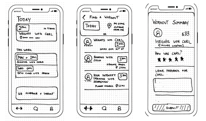
I started with a series of iterative sketches to nail down the basic flows and patterns.
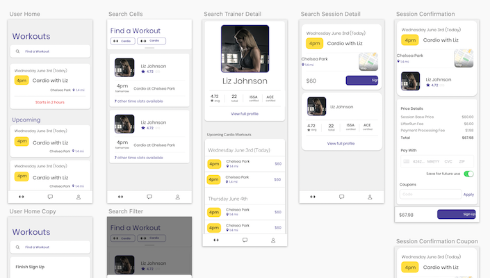
Then switched to Sketch for higher fidelity mockups to build an overall brand and "feel". It's tempting to start writing code asap, but I needed to go through several design iterations to land on a cohesive style, which then streamlined development down the road.
User Flow:
Search
Displaying the best search results depends on multiple preference vectors. We should experiment to find a good default, and allow the user to adjust their mix of preferences. Every search result is some mix of these:
- Time: "I want to workout exactly at 1pm today"
- Location: "I don't want to travel very far"
- Trainer: "I want the best trainer possible for my needs"
- Price: "I want to spend the least amount of money as possible"
We needed to offer flexibility without overwhelming the user with data and options.
Book
Review the trainer's profile and reviews to make a booking decision. Choose from available times & locations, book & pay! Make this as seamless as possible to reduce dropoff.
Meetup & Workout
Meeting in a public park can be awkward. During expected meetup time, aid user with live maps, chat availability, and support options. Post-workout, push user to review the experience - reviews are crucial to fuel the system!
Trainer Flow:
Set Schedule
To show up in search results, trainers must first set their time & location availability. Support ad-hoc scheduling or recurring time slots. Use 1 hour time blocks for consistency and efficiency (otherwise scheduling logic gets crazy complex)
Review Booking
Trainers need to be aware of incoming bookings, and must have the option to vet users. Notify trainers to review user's profile and force an 'accept' or 'reject' decision asap.
Meetup & Workout
Again - meetups are awkward. Provide as much data and communication channels as possible to aid the process. Post-workout, force trainer to review the user.
Payouts
Make earnings data transparent and easily available. Trainers need to be able to payout to their bank account regularly.
Technical Decisions
Marketplace Payments - Stripe Connect
Ultimately, before I took on any of this, I needed to decide whether this project was feasible. When JW initially pitched the idea to me, my first hesitancy was about "handling the money", and the logistics around marketplace payments. I found Stripe Connect as a crucial piece to the puzzle - it's used by Lyft to power their marketplace - so I was confident it would handle our similar use cases. Everything Stripe offers is fantastic - great documentation, simple to integrate, and free to try. This project wouldn't have been possible without it.
I integrated everything fully using Firebase Functions to build APIs, receive webhook messages, and inject server-side keys from config. It's incredible that I was able to get a full two-sided marketplace running using only a few dozen serverless functions.
App vs Website, React Native, Typescript
A mature product would ideally support both Web and Mobile clients. But since the core interaction involves in-person meetups and requires quick mobile access and high-fidelity maps and gps, I decided to build mobile-first.
React Native is my default platform for native apps nowadays - I'm incredibly comfortable and quick with it, and it produces great performant apps.
Typescript is also my default - I find that I'm actually quicker with it than JS, since I can comfortably rely on intellisense and data types as I build. There's no reason not to use it, IMO.
Cloud Platform - Firebase
With the constraints of an MVP, I strongly favored a cloud platform that enabled rapid development and fully managed infrastructure over everything. I've enjoyed using Firebase's console and Mobile SDKs in the past, and was confident I could build quickly on top of Firestore and Functions. Even though I'm AWS certified, I felt Firebase would allow quicker development - the Paradox of Choice in AWS can be overwhelming!
MVP Tradeoffs
At each decision point I was constantly forced to consider the massive scope of the project and reel it back to bare MVP form. There were too many tradeoff to list them all, but here are a few:
- Sessions were forced to be exactly 1 hour, and must start at the top of the hour to reduce scheduling complexity.
- Group sessions were not supported, only 1:1.
- Static set of predefined locations to reduce meetup logistics and safety concerns.
- Firebase Functions were used for all the APIs. Despite an occasional ~1s cold start, it saved me the complexity of any and all server management. Absolutely worth it.
- Firebase Firestore had very limited search capabilities, so filtering was limited on what we could index natively, and a couple queries wouldn't have performed at scale.
- Our Marketing website (lifterrun.com) was built using off-the-shelf Squarespace due to time constraints.
- Interactive map was cut back to standard libraries and static coordinates.
- Trainer onboarding was done manually by setting a
isTrainerflag on theirUserrecord in Firestore.
Challenges & Edge Cases:
In addition to the many technical tradeoffs above, several cases were just too complex to handle for MVP.
- Rainy days - our dependence on ourdoor parks left us vulnerable to the elements. Rainy day, or reschedule cases weren't handled within the app yet due to complexity - we forced a 'cancel' and 'rebook' - which is suboptimal.
- Coordination and turnaround time - We forced trainers to explicitly 'accept' or 'reject' a booking request, which was necessary for transparency and safety, but not all trainers can be prompt enough to respond within an hour (or often even a day) - leaving user bookings in purgatory.
- Real-world uncertainties - A last second cancellation or no-show from a user or trainer is an awful experience, but we simply didn't have enough time to design and build a full support flow here.
- Trainer scheduling tools - setting availability in-app required us to build scheduling tools which were duct-taped together. A full suite of tools would be optimal, but we only supported the bare minimum.
The Launch: A Chicken and Egg Story
We soft launched the app via TestFlight and JW booked several workouts with a small set of trainers he personally knew and onboarded. Success! The app worked! But we immediately found many pain points and scoped work to address them. We also set our sights on building a user base - requiring careful calibration and supply of both trainers and users. Trainers wouldn't join without a healthy supply of users to book sessions. Users wouldn't join without a healthy supply of great trainers nearby. It's difficult.
We knew we needed to nail the experience - users will stay or leave based on their first training session. It's one thing to launch an immature and buggy SaaS product at a discount, but another thing when it impacts real-world personal interactions and costs ~$60+. So we scoped out the work we felt necessary to launch publicly. It was a lot.
The Mountain Ahead
Taking a step back and picturing the vision ahead - we were essentially trying to build Uber or AirBnB from scratch. Imagining the organizational and functional mountain was overwhelming. Yes, we barely scraped together a working MVP, but we weren't comfortable releasing it publicly. And we weren't sure which specific pieces we needed to get there.
I wish I could say that I doubled down, rebuilt the app to our liking, and released it publicly. But instead I took a step back, saw the mountain ahead, and questioned if I was willing to devote thousands of hours towards it. The fact that I was asking the question alone answered it for me.
It was tough. I poured so much time and energy into this project, and I really enjoyed it. But burnout really set in - initially for my day job, then also for LifterRun. (Keep in mind this was a side project after all - during a global pandemic). I bit off way more than I could chew and while I enjoyed the challenge, I ultimately wasn't mentally prepared for the road ahead. I decided I'd step back to rest and figure out what to spend time on next.
Takeaways
- Yeah, I bit off more than I could chew. My optimism got the best of me.
- Burnout sucks. Side-work as an antidote for day-work burnout doesn't work. Say it again.
- Multi sided marketplaces are really tough to build from scratch. The technical complexity is comparable to building multiple separate products. And when human interaction is part of the flow, there are way more edge cases than you'd think. Next time I'd look for additional support in the form of developers, designers, and raising capital before taking on a challenge this large.
I still really enjoyed working on this project. I learned a ton about building marketplaces, increased my system design and UI/UX skills, and also learned a lot about my personal limits. No regrets.